Finding Your Dream Job


Surveys specifically tracking whether lifetime retirees worked their “dream job” are rare, but general workforce and retirement studies show that the vast majority of people never attain a dream career, and career dissatisfaction often drives post-retirement work. Across multiple workforce surveys, only about 7% to 10% of adults report currently working in their dream career, meaning up to 93% of the workforce has taken a different path.

Moneypenny Resources found that only 9% of those surveyed thought that they were in their “dream job” or career. There is a lot of fascinating data on what jobs seem to bring the most satisfaction, who are the “happy workers,” and even what states or areas of the US have the happiest workers. In 2023, Wyoming had the highest percentage of workers who are happy (100%, how could this even be true?) Washington DC sat at 87.5% so I feel the data must be skewed.

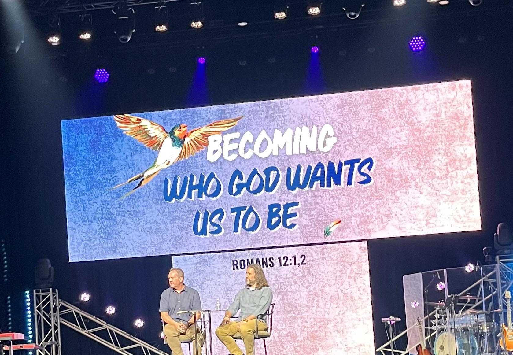
Never-the-less, this past Sunday’s message at the church I attend here in Northern Virginia had me wondering about dream jobs. Now that I have been retired for 8 1/2 years, I can look back at my own career in graphic arts with a good deal of pride mixed with a tiny twinge of regret.

I had started out in college majoring in Fine Arts and fully expected to go on to obtain a masters degree in either printmaking or painting. I moved to San Diego and it was there in 1976 that my eventual career path took a slight left turn. I remained in graphic arts and production for the next 26 years, eventually retiring from a church as their director of communications in 2018. And I loved every job I’ve had: they quite often combined my love of art with that of language (majored in Art, minored in English). But did I ever obtain my “dream job”? I don’t think so, though I have no regrets about the career field I eventually found myself in.

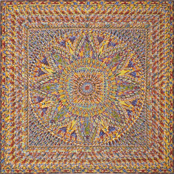
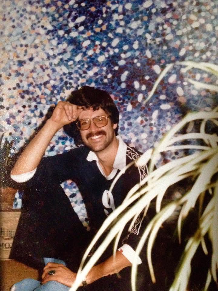
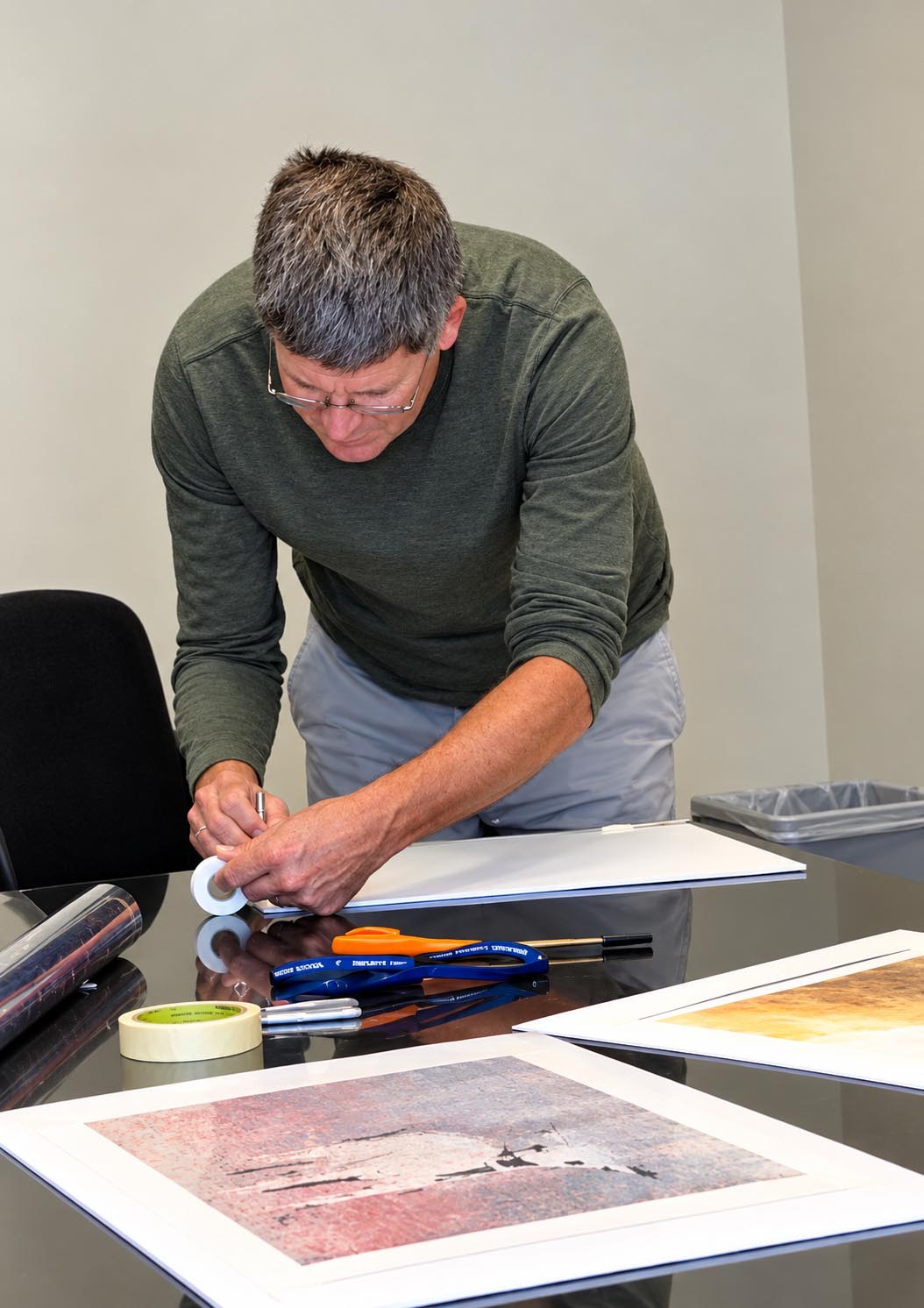
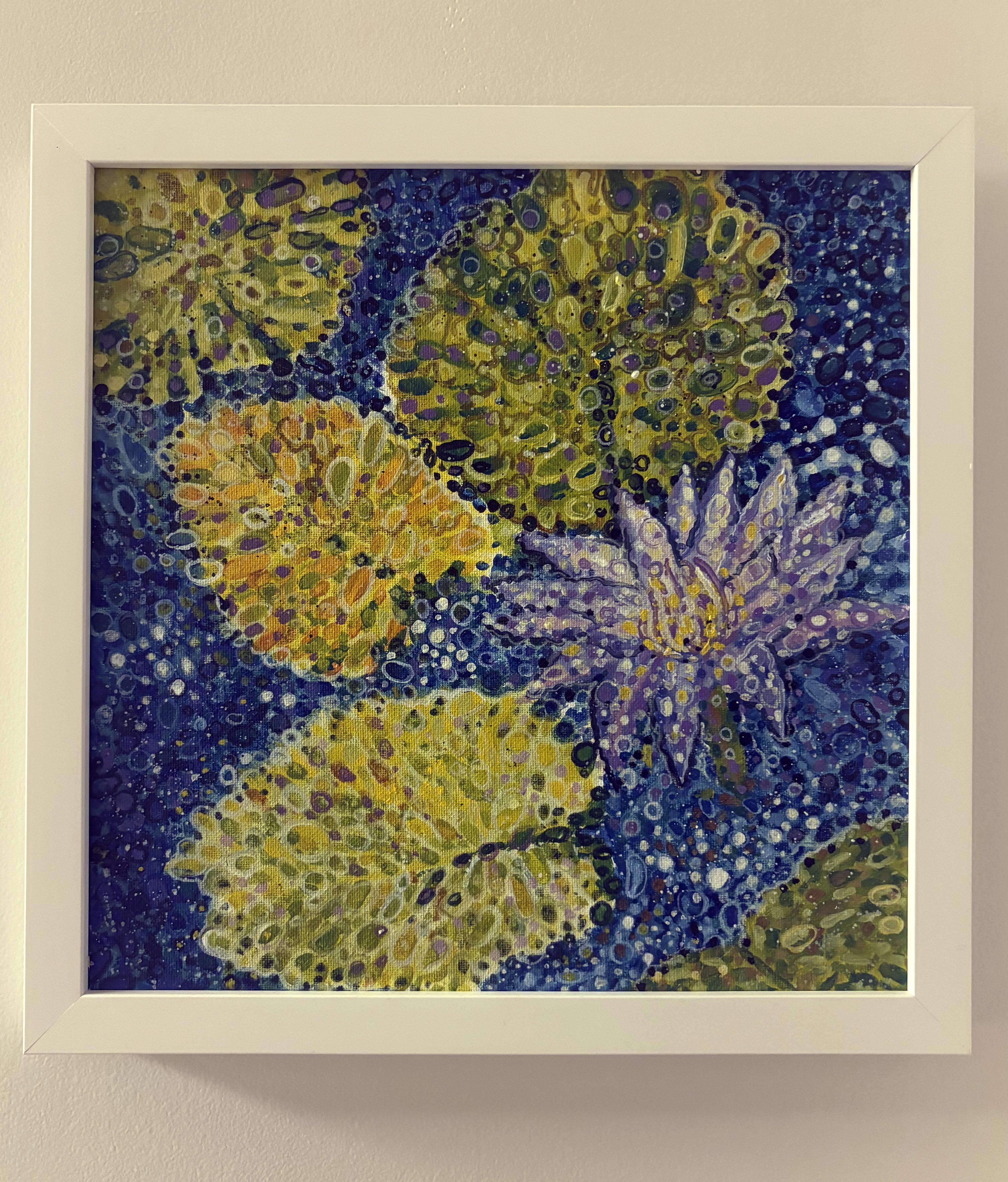
Above, one of my paintings from my senior show in 1974; working on matting prints of a friend’s artwork; and a recent acrylic painting of my own. I still work in that pointilist style, though on a much smaller scale than I did before.

According to workforce research, the choice to pivot away from a dream job is rarely due to laziness; it is almost entirely dictated by real-world friction. Again, data from Moneypenny highlights the top barriers preventing people from ever obtaining their dream: financial constraints (specialized training or education); lack of opportunities; or family obligations. Looking back at my own career path, it would have been financial constraint (the cost of advanced education) combined with fear of failure.

In a lifetime career regret series by Business Insider, hundreds of older Americans noted that they chose paths purely out of survival rather than passion. Many expressed deep regret over not prioritizing higher education or specialized training when they were younger, which permanently locked them out of the competitive “dream” fields they actually wanted to enter. That tracks, doesn’t it? The very high cost of education can certainly act as a gatekeeper, admitting some, excluding others from a career path.

Interestingly, what people regret while working changes dramatically once they actually retire.

  • Before retirement: People stress over a lack of status, missed promotions, or not making enough money.
  • After retirement: The narrative flips entirely. According to a large-scale study of over 750 retirees tracking what they regretted most about working past age 60, the overwhelming sentiment was the loss of time

Once the job is gone, retirees rarely wish they had climbed higher up a corporate ladder they didn’t care about. Instead, they express profound regret that they sacrificed their prime physical “health span” working a job they merely “enjoyed to some degree” instead of retiring sooner to chase personal passions, travel, or spend time with family.
Ultimately, the data shows that most people do realize they settled for second best, but they only truly mourn it once the structured routine of the career vanishes and they are left trying to figure out who they are without it.

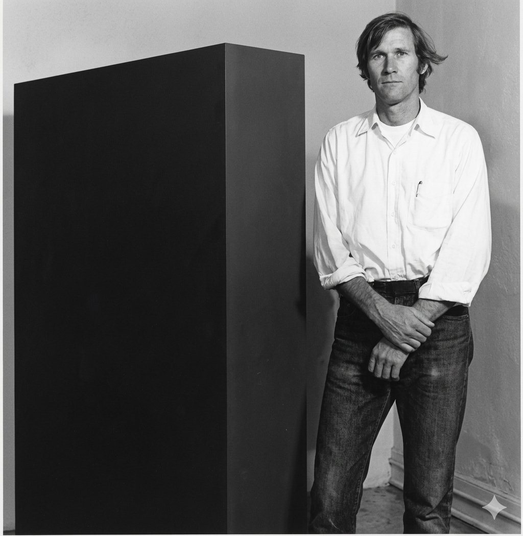
While working on this post, I reached out to a college-friend of mine for his perspective. John is a few years younger than I am, and while we both attended the same university (go UNR!) at the time we pursued different majors. Today John McCaskill is the Artist/Owner of Studio Jomac in St. Pete Beach Florida.


John, as my wife and I were talking, I realized that I had worked some very interesting, and fulfilling jobs over my career. But now that I am retired, I don’t think I actually ever had my “dream job.” But I thought of you and your transition to full time artist, printmaker, and studio owner. To me that seems much more closely aligned with obtaining your dream job. Any thoughts you could share with me on your own journey?

“Becoming a full-time artist, printmaker, and studio owner didn’t happen overnight. I worked hard for many years to create the freedom and opportunity to build this kind of life, but it has absolutely been worth it. I love creating, and I love having a studio where I can explore ideas, experiment, and bring them to life.

You were actually an early influence on my creative journey. When we were roommates and you were working toward your BFA, seeing your large-scale, dot-based paintings helped open my eyes to the possibilities of pursuing art seriously. Our time working together at Outdoor Posters also left a lasting impression. Even today, I still posterize and lay out many of my portraits using principles much like those we worked with back then.

For me, a dream job is not necessarily something you find. Sometimes it is something you gradually build through years of work, experience, and persistence. It also requires an openness to something larger than ourselves, a higher wisdom and universal harmony that we can tap into when we become truly receptive to the creative spirit. My earlier careers and relationships gave me the skills, inspiration, and resources to arrive here, so I see this chapter as part of the same continuing journey rather than a departure from it.”


Where are you in your own personal journey? Do you feel like you’ve arrived or are you still on the road? Sometimes it helps just to check in with a friend.

You can read more about John’s story and view his artwork on his website here. And definitely check out his gallery when you are in the St. Petersburg area.

Here’s the Prompt

With AI, and using ChatGPT or Claude as an example, what you get out really depends a lot on what you put in, the prompt. Even then, the results can often be a mixed review. If you have a paid subscription your results may vary: mine is a free subscription and so far I have been happy with the results. But sometimes I just have to wonder…

Over the past several weeks I have been working with a team from our church to create a warm and inviting atmosphere for our Christmas Eve services. Yes, it was 90 degrees yesterday, it’s only August, but with projects like this you really need the time to think about, create, socialize or promote the ideas to the team, and have time to redesign or adjust. So we are working on an event that isn’t scheduled for nearly 4 1/2 months from now. And now you know a bit about church planning.

The area I am working on is our Lobby. It won’t be the first thing our guests and member see when they arrive December 24–hopefully we will have added some Christmas decor to the parking areas and our patio areas before folks ever enter the building. But once in, what will they see?

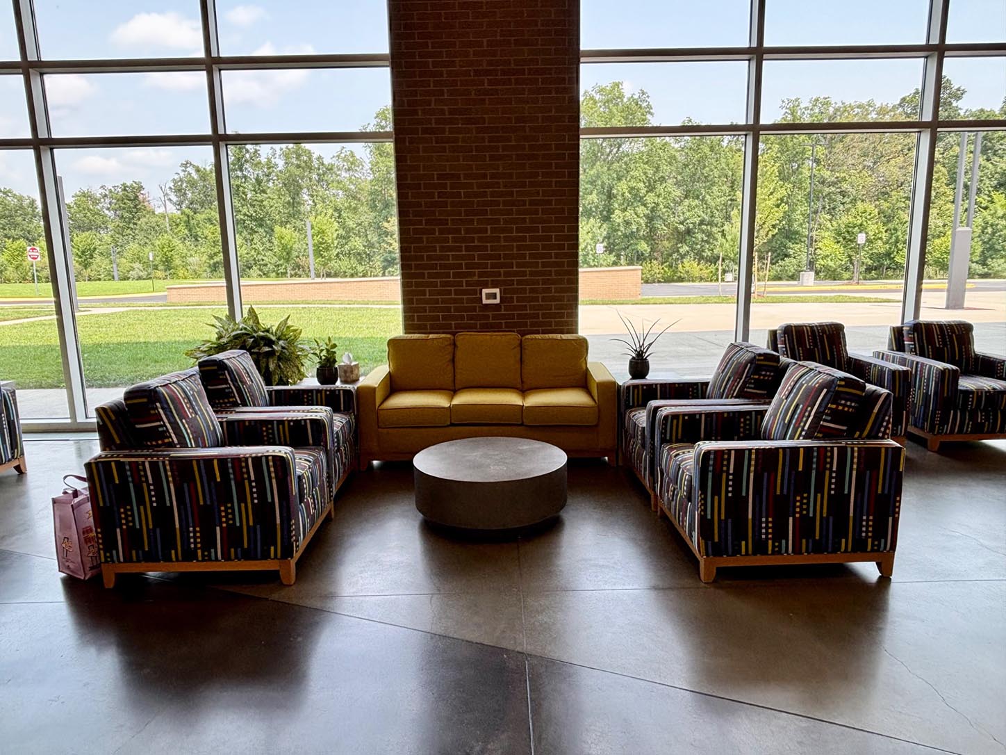
Our church has a Mid-Century Modern design aethetic in a very contemporary brick, concrete, and glass building. Whatever we come up with has to fit in with our furniture, concrete flooring and that massive glass curtain wall that overlooks our patio and a forested area beyond. It isn’t quite “Colorado cabin” style but at the same time, it isn’t MCM Palm Springs California either. But by rearranging some of the seating areas, perhaps adding pillows and blankets, area rugs and smaller design elements, we might be able to transform a very large space into something a bit smaller and more welcoming.

However. We are visual people and I’ve found it’s easier to present a few pictures of what I have in mind than it is to describe the changes in a Word document for nine people.

Below I have presented the original photo I uploaded to ChatGPT and the initial prompt. It took five iterations before I got what I thought I would have received as a first try. Let me know if you think I could have been more specific with Chat in my instructions. Or perhaps this is how we work with AI? a little trial and error until we say, “that’s good enough for now.”

Here is the prompt I gave ChatGPT: 

I’m looking for another Christmas decor idea here. Please remove the two chairs on the left and replace with the yellow couch. To the right of the brick pillar place a lighted and decorated Christmas tree. Remove the round coffee table and place large wrapped Christmas presents (4-5) up against the brick. Add a sled leaning against the brick.

Below are the images I received back. I like #6 and think that it most closely resembles what I had asked for, but you be the judge.

The final image (couch on left facing the two chairs, Christmas tree with presents and a sled against the brick wall) looks the most like my original intent. We did gain two pillows in the final design, and after the first image I had Chat brighten up the room. And for some reason the couch seems to have grown two feet wider but overall, not bad. I forgot to add the area rug but I’m not one to test the fates, this will do.

How about you? Have you gotten more or less than what you’ve tasked AI with? I have Photoshop, and when it comes to time spent, ChatGPT beats me hands down.

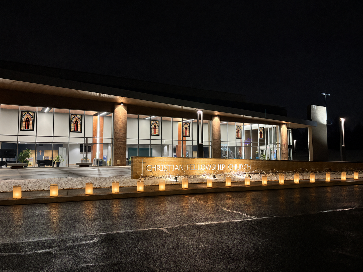
By the way, if you are looking for a warm and engaging church to attend for Christmas Eve services this year, give us a try at Christian Fellowship Church in Ashburn VA. Or stop by any Sunday and try out the couches–they are very comfy!

A Garden Pond


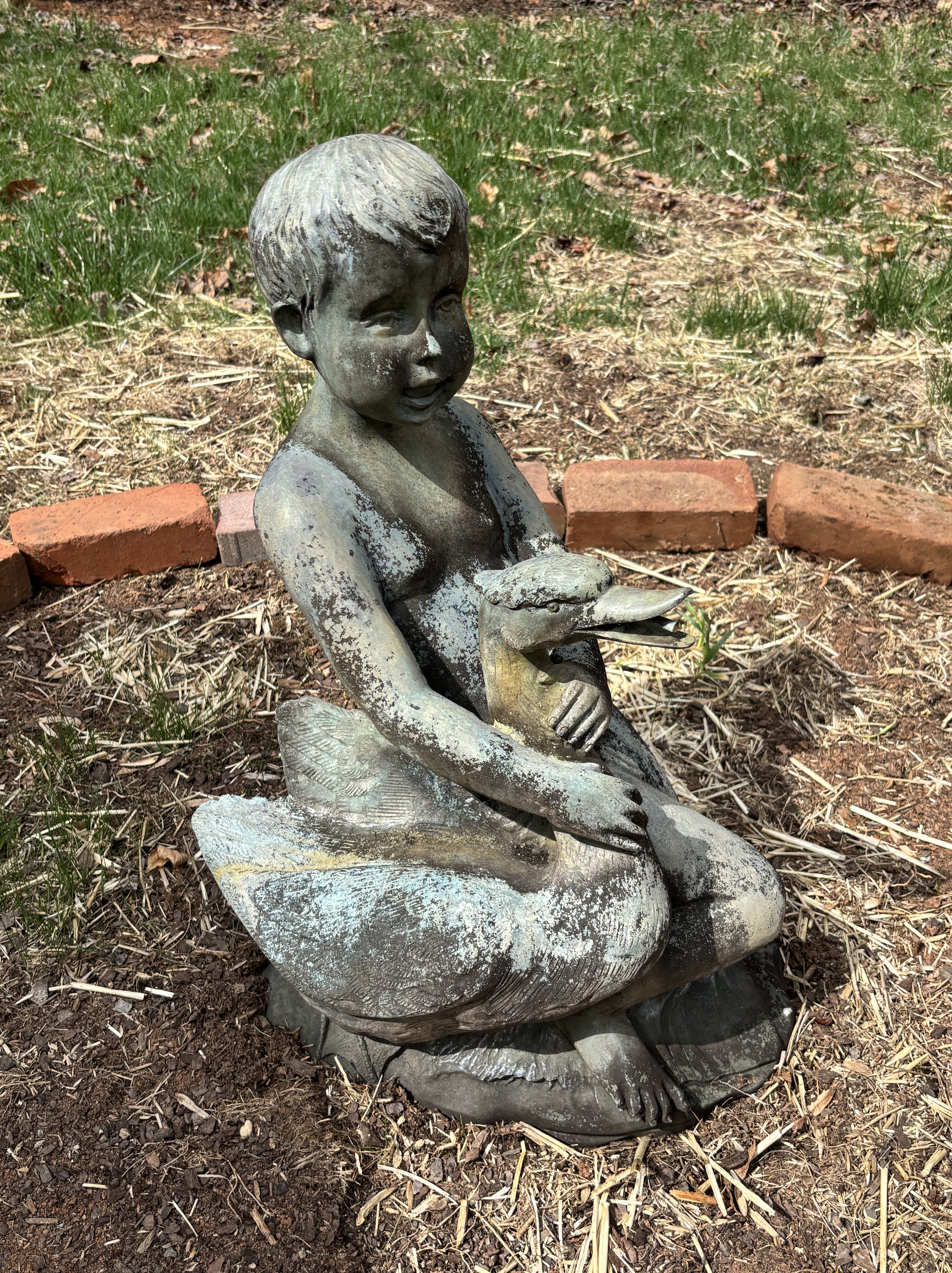
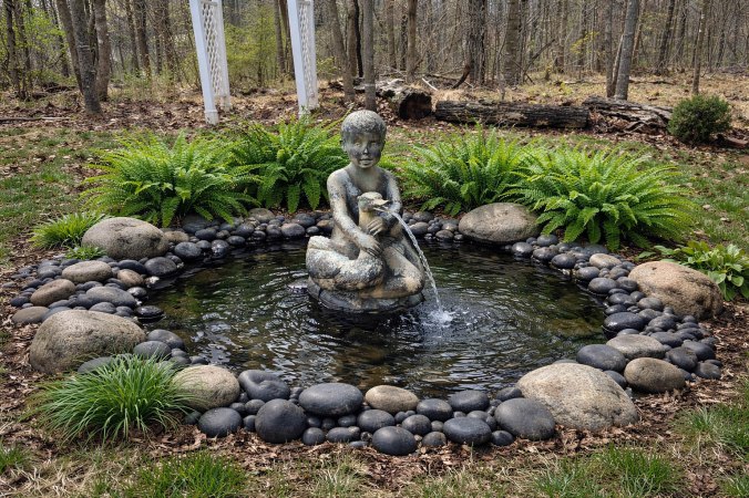
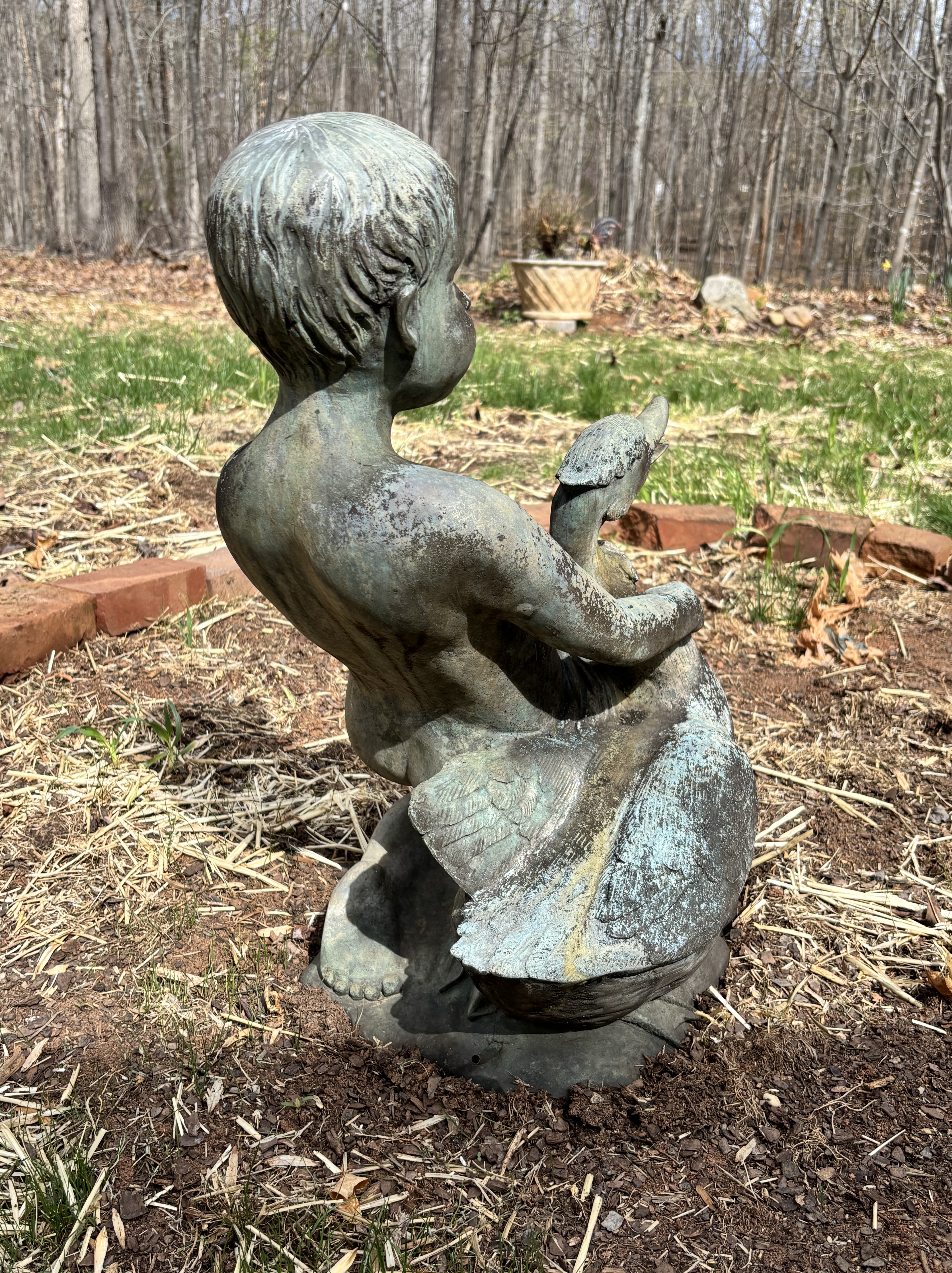
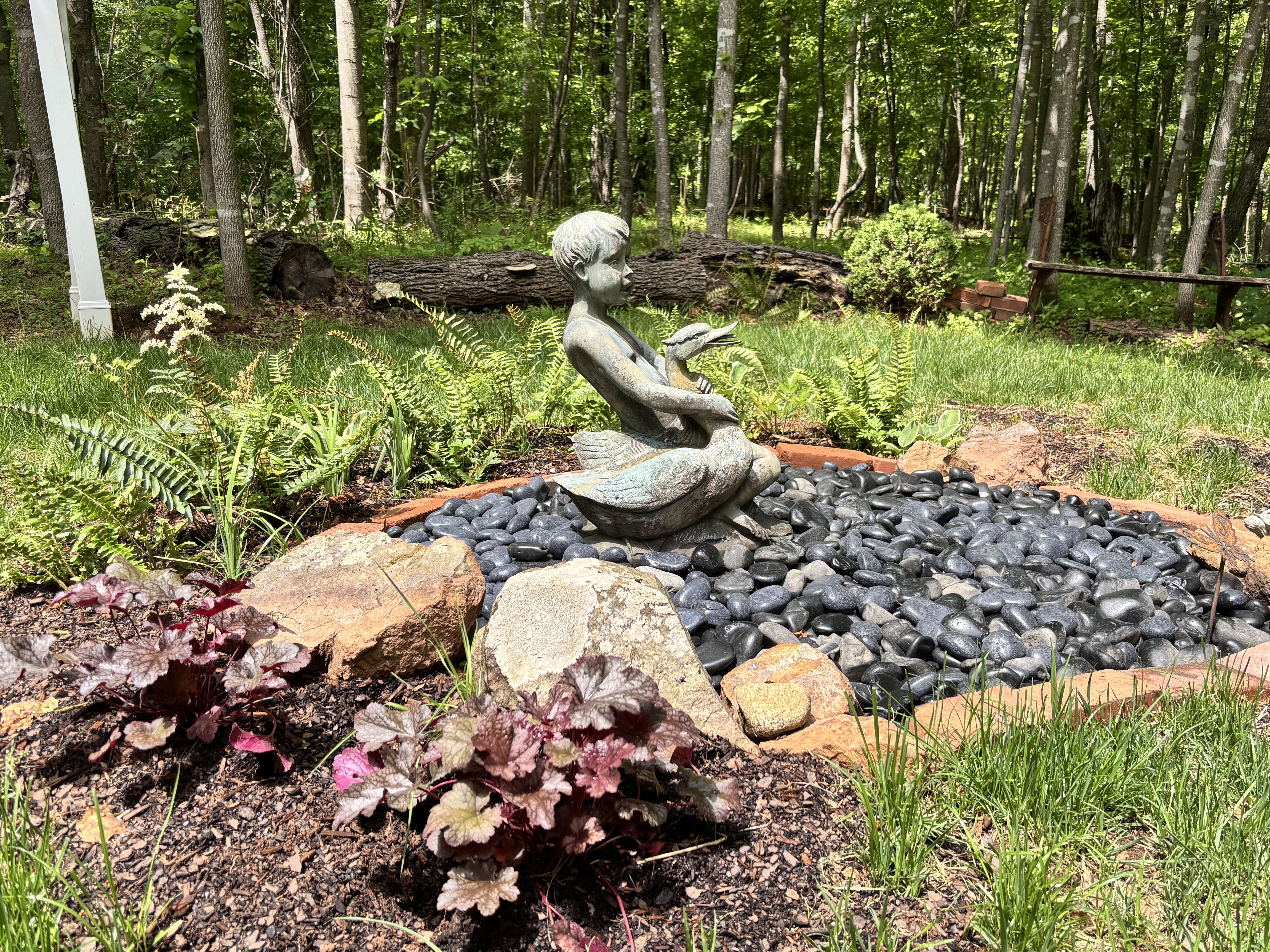
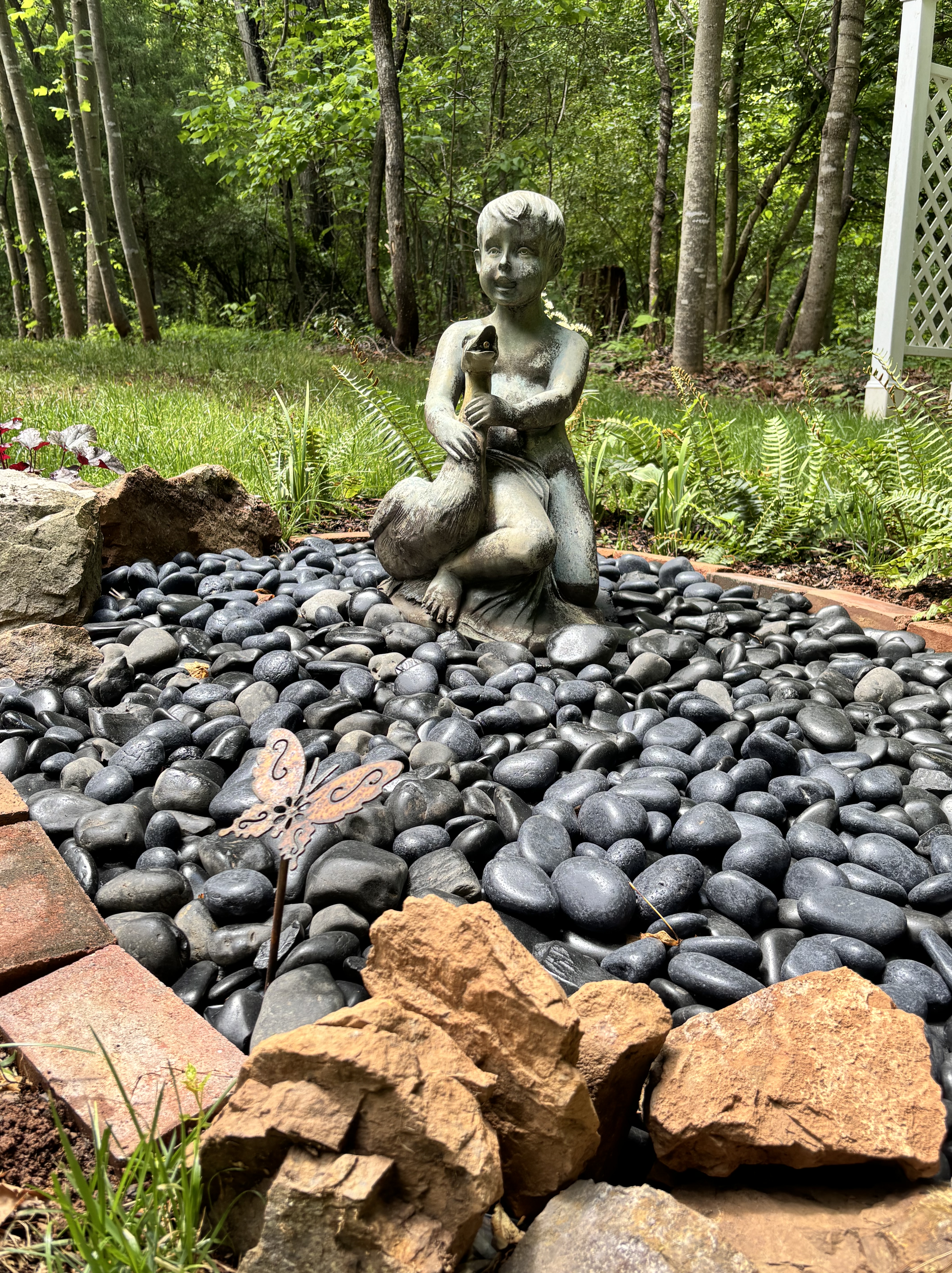
Boy with Goose Fountain

The original Boy and Goose sculpture is a 2nd-century CE Roman copy based on a Hellenistic Greek original (circa 2nd Century BCE) often attributed to Boethos of Chalcedon. It is a well-known motif depicting a seated boy with a goose or duck, with various versions housed in museums like the Louvre and Galleria Borghese. When this particular fountain sculpture came up for auction I knew it was going to fit in beautifully with the pond I envisioned for our backyard.

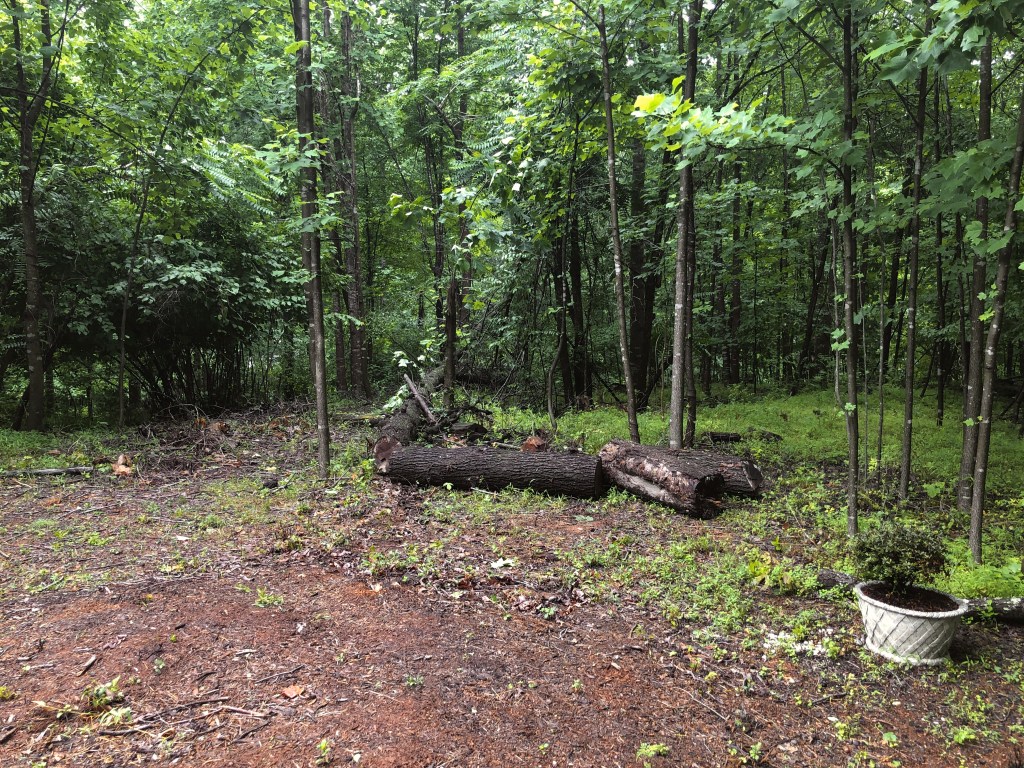
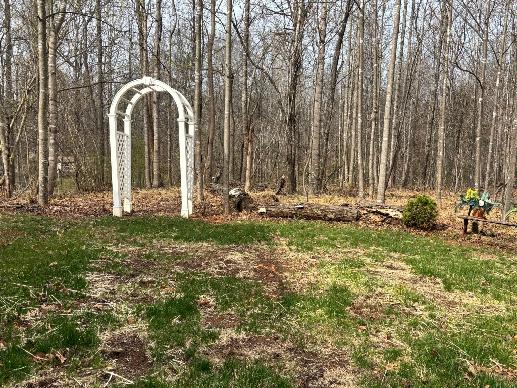
We have an area of the yard that can’t seem to grow grass: well, it can grow grass, it just has a hard time sustaining it. It could be grubs, it could be the poor condition of the soil, it could even be that it doesn’t really get enough hours of sunlight to grow a lush green carpet of grass. Whatever the reasons, I’ve become convinced that a rock garden or pond would look great in that area and certainly require less upkeep. When I’ve planted grass seed, the forces of nature are definitely working against me!

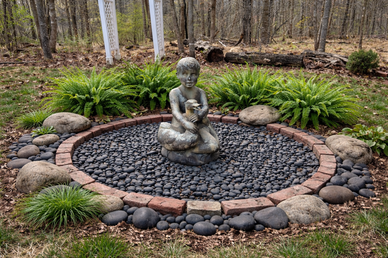
With the help of an online planner I decided to pivot from a field of grass to something smaller and more engaging. A wet or dry pond, each had certain advantages though different design requirements.

Here’s the full concept narrative:

The idea — the island is read as a dry pond, roughly oval, about 2–3 metres across. The black river pebbles give it a still, reflective quality that plays beautifully against the weathered stone of your sculpture. The boy with the goose becomes the “source” — as if he’s sitting in the middle of a pond he’s claimed.

Sculpture placement — position the boy slightly north of centre so that when viewed from the house or a main seating area, he sits in the sweet spot of the composition. Raise him on a flat irregular stone or small concrete plinth so his base is just above the pebble line — this separates him from the ground and gives him presence.

The pebble bed — lay a weed-suppressing membrane first, then 5–8cm depth of black river pebbles. This depth keeps them from migrating and gives a solid, finished look. The contrast between the dark pebbles and the greenery around the edge is what makes the “pond” illusion work.

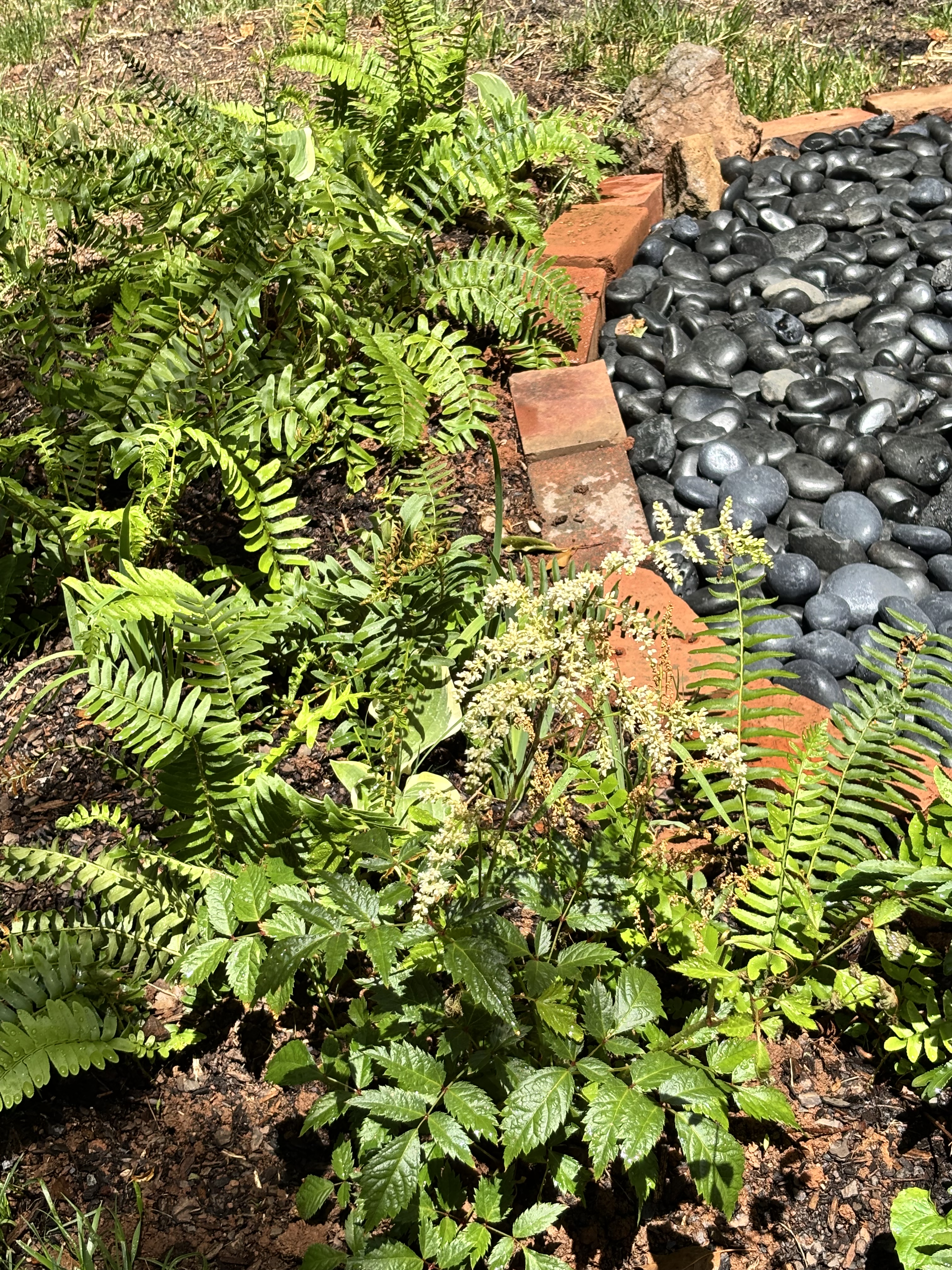
Ferns around the edge — use soft, arching varieties like Dryopteris erythrosora (with its warm coppery new fronds) or Polystichum setiferum for a lacy look. Plant them so they droop slightly over the pebble edge, softening the boundary between “water” and “land.”

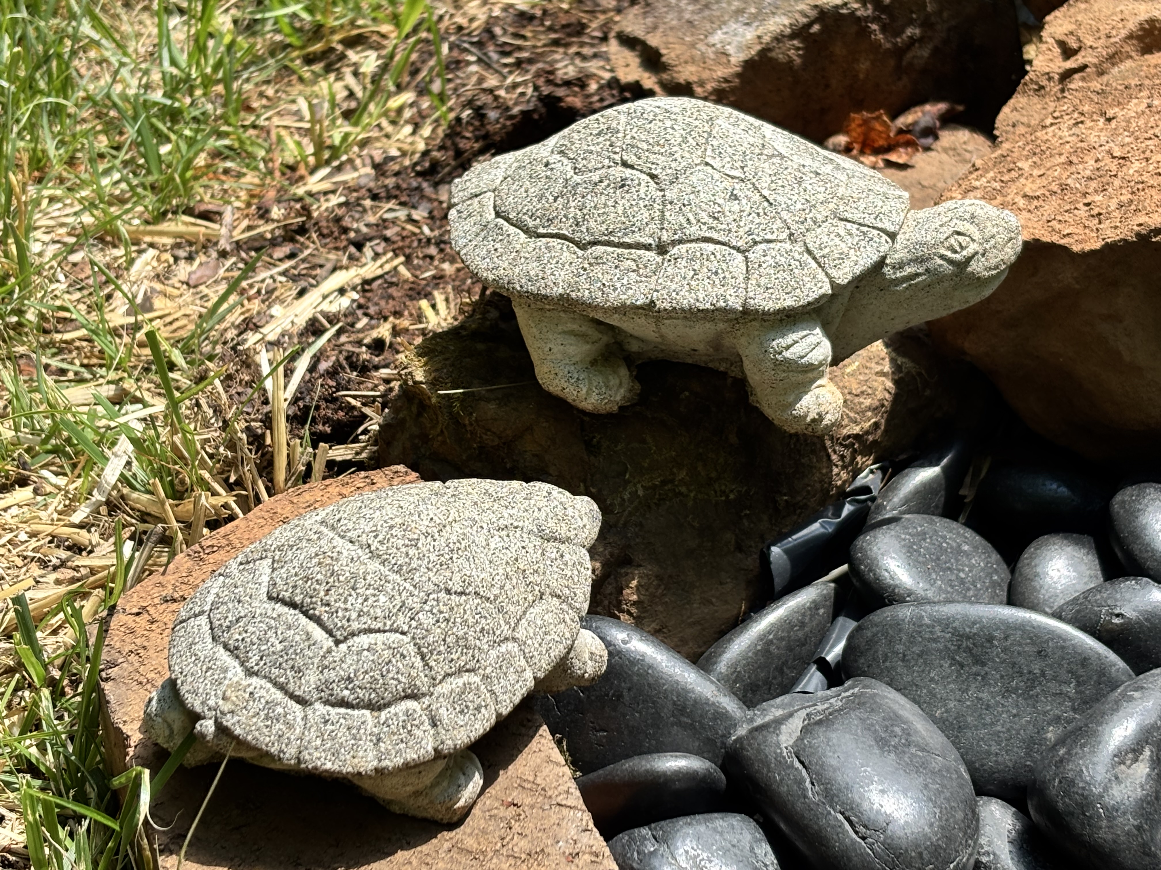
A finishing touch — consider one or two rounded mossy stones tucked among the ferns at the edge. At that point the whole garden reads less like a planted bed and more like a scene discovered in nature — exactly the mood your sculpture deserves.

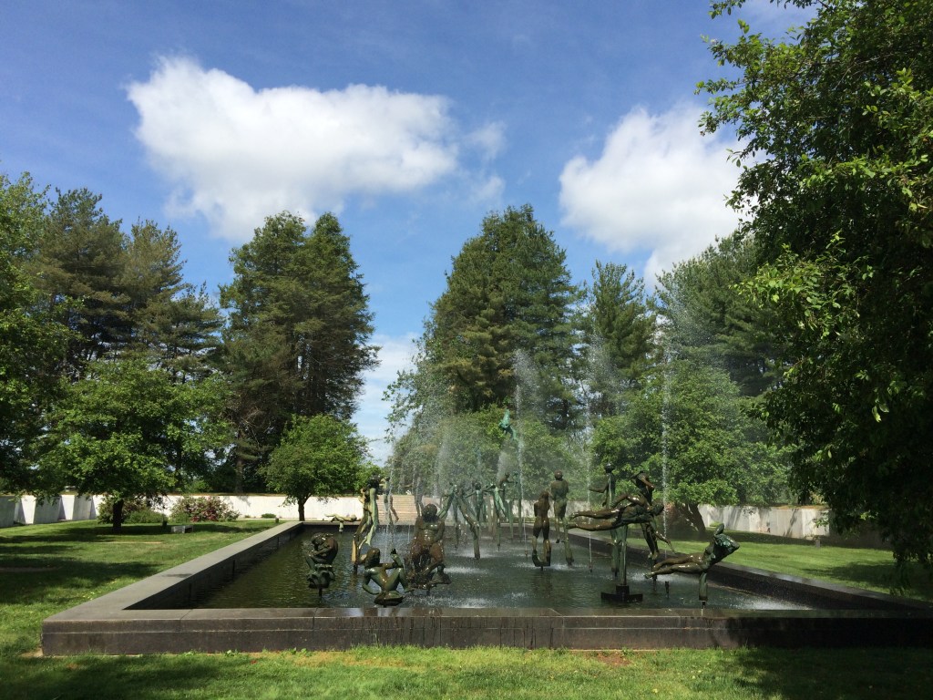
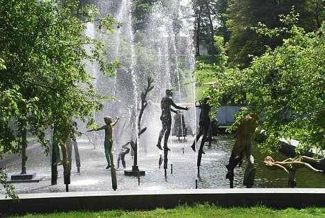
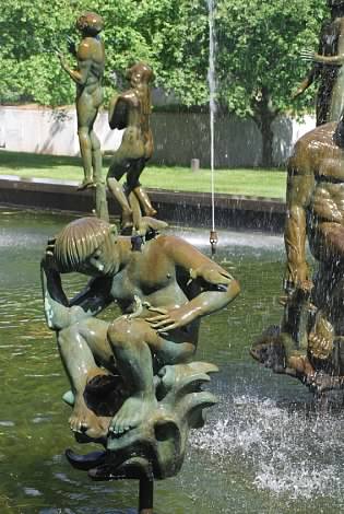
I might add that the garden water feature I had in mind is one that I had seen at the National Memorial Park in Fairfax VA. The Fountain of Faith, sited in the National Memorial Park in Fairfax VA was created by Swedish sculptor Carl Milles and dedicated in 1952 after having taken 12 years to complete. The fountain sits in a large courtyard and consists of 37 figures. The figure of a young boy with a bird on his shoulder and arm was especially moving for our family and we used the image in a poster at the memorial service of our nephew who is buried there. The sculptor was a prolific artist and taught at Cranbrook Academy of Art for twenty years here in the States, 1931-1951. You can read more about him and his art here.

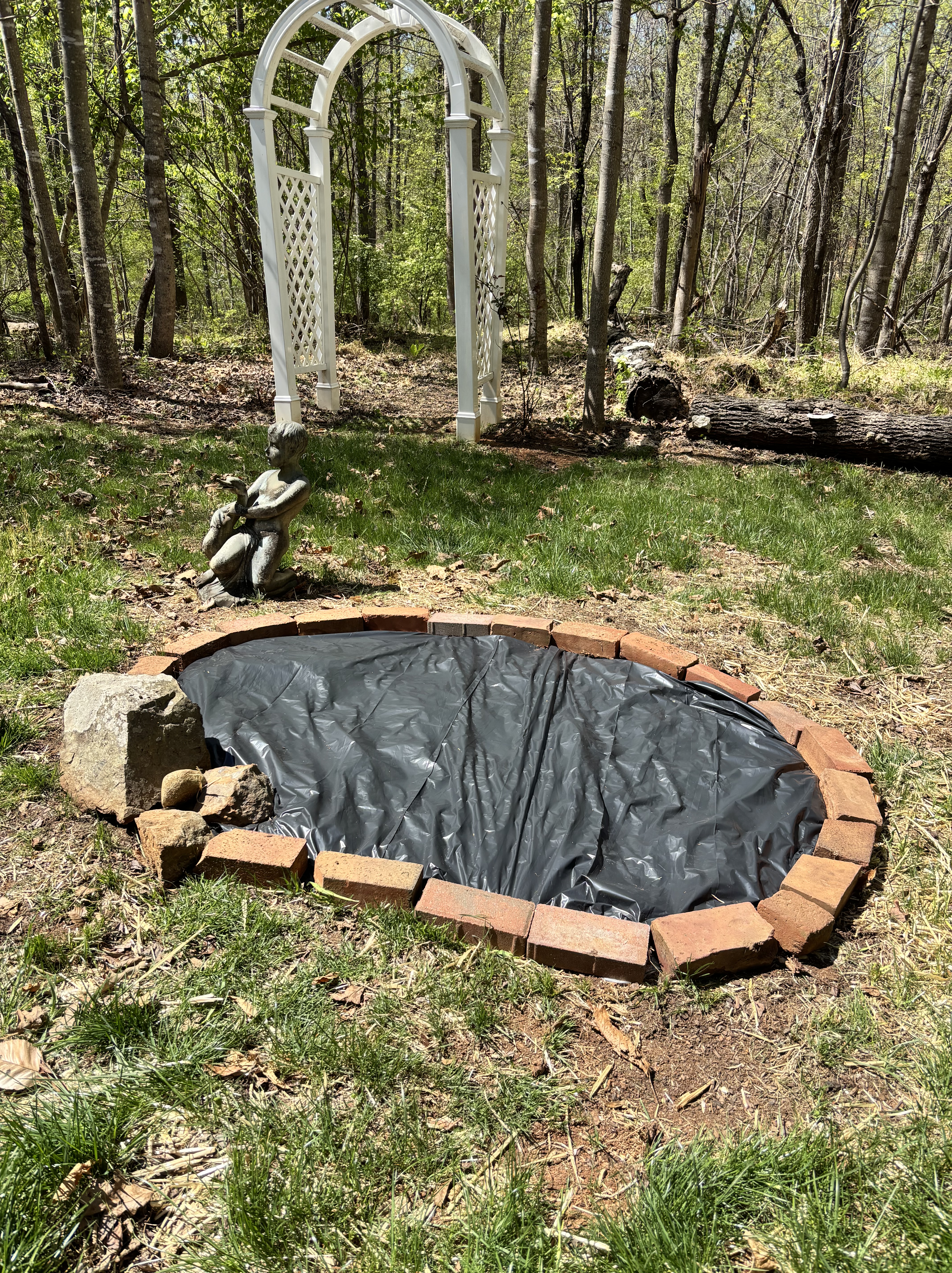
We’ve been working on our pond for the past several weekends. With a plan in mind, I’ve tried to source most of the accent pieces from our property. The border of the pond was created from odd-sized bricks we’ve found lying throughout the woods, discarded from the remnants of a brick pathway and possibly a patio in the former owner’s backyard. The rocks and ferns are from the woods that surround us. The initial design was created through AI; a version of a wet pond was gorgeous but truthfully would have required too much effort to create and maintain, hence the river-rocks version.

Hopefully the garden pond will help to create an area of quiet respite, maybe we’ll add a bench or seating area close by for reflection and comtemplation.

The finished pond looks very much like the AI-generated concept. Our plants have some growing to do before they start to fill in, but the ferns, astilbe, huchera, and Siberian irises that I’ve planted are really starting to look good. And there is less grass to mow! I love it.

Where the Apple Falls

I have always loved art. Art with a capital A, though I’ve generally favored painting over drawing or sculpture. Loved art and loved making art.

One of my earliest memories is of attending an outdoor art show and offering my unsolicited — and at that point hardly well-trained — critique of a painting. The artist took it in good humor, though having stood in that same spot years later, I can say it must have been a little unsettling. Everyone has opinions about Art, of course. But a youngster critiquing technique? That’s a different story.

In junior high school I was given the opportunity to practice what I had been preaching. I loved helping paint the backdrop flats for our school musicals — one each year from 7th through 9th grade: Ali Baba and the Forty ThievesThe Pirates of Penzance, were two that I remember having worked on.

Through high school and college I continued to paint, though I stayed away from the theater department. Perhaps I assumed large-format work would never be my strength, or that there couldn’t possibly be a future in scenic design. My loss.

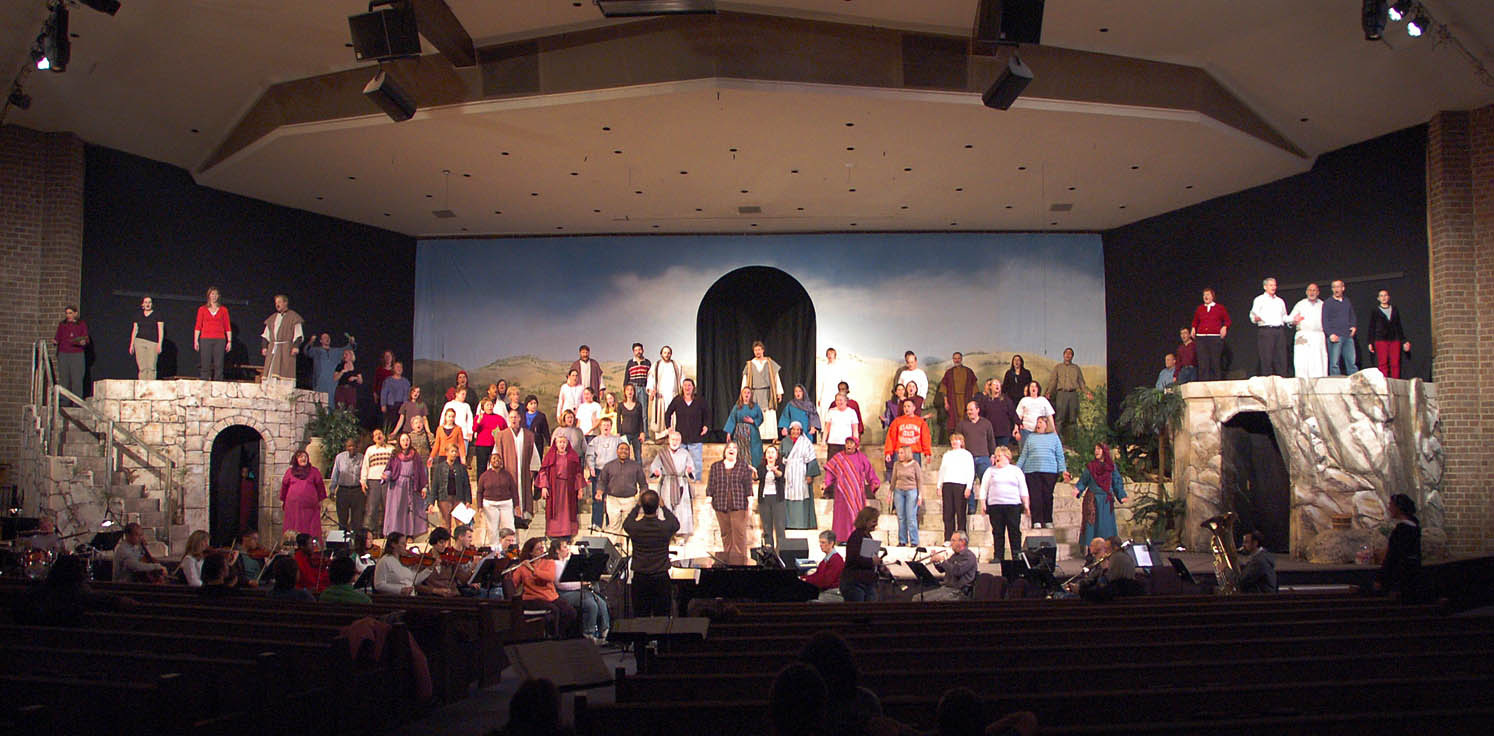
Rehearsal on stage at Immanuel Bible Church (2008)

Then, in my late 40s, I picked it all up again when I volunteered to help with the sets for our church’s annual Easter pageant productions. These were full-scale presentations: scenery, actors, singing and dancing, orchestra, theatrical lighting — the works. With nine or more performances each spring, they aspired to a high level of theater quality using all volunteers. At the time, much like that young art critic years before, I thought they could probably use a little help with the painting. And so I volunteered, first as a background painter working on rocks, and later as scenic designer with a team of volunteers helping to bring to life the 1st century world of Jerusalem. 

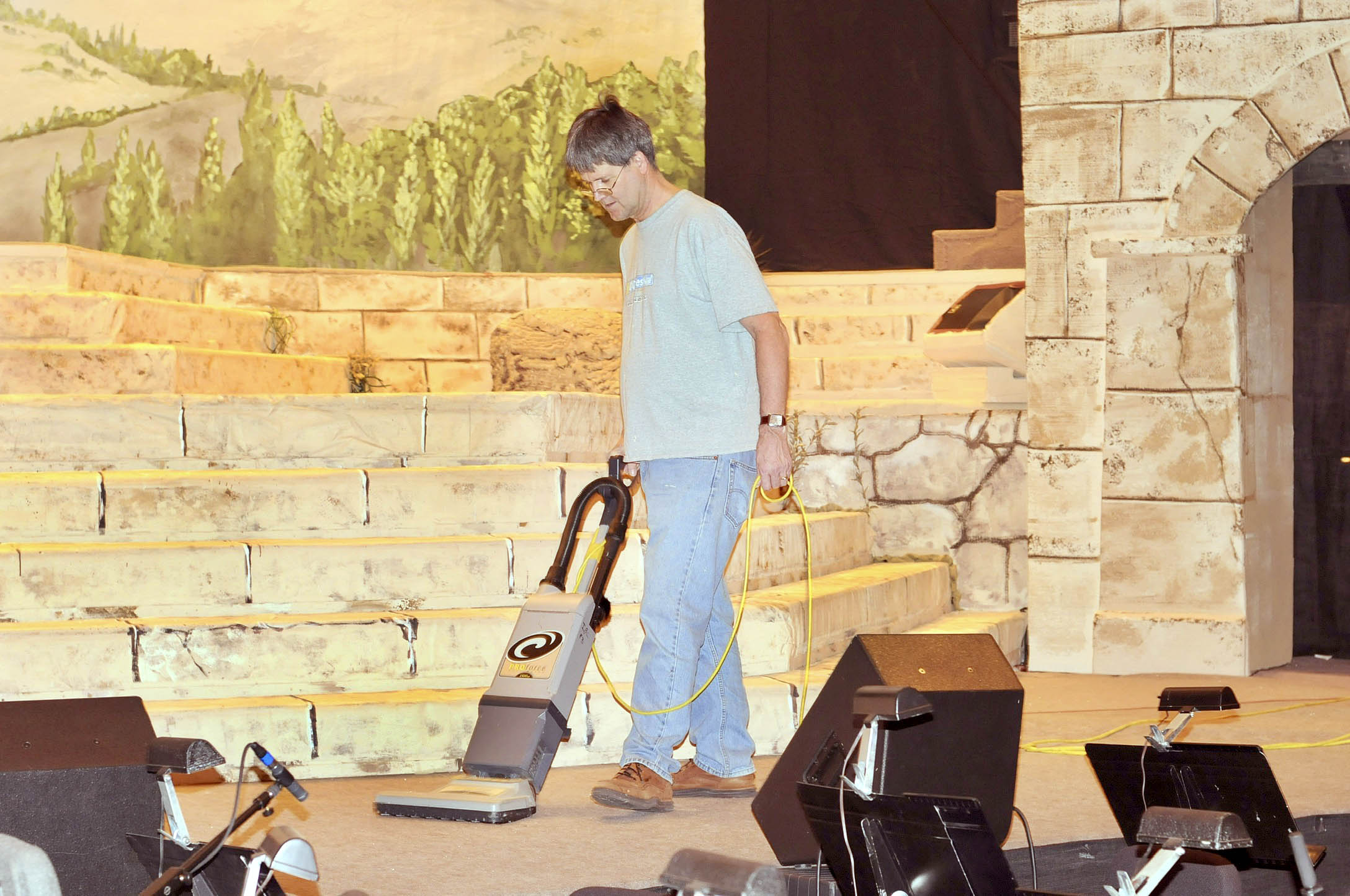
Cleaning the stage before rehearsal

One of the great blessings of living where we do is easy access to world-class theater. We’ve taken the kids to see WickedMary PoppinsThe Lion King, and other productions at the John F. Kennedy Center for the Performing Arts. And of course, a train trip to New York City for a weekend Broadway show was something we could never resist.

This year my oldest granddaughter graduates from high school, and in the fall she’ll attend a local university majoring in theater set design. I couldn’t be more proud of all she has accomplished — from the ten productions she participated in during her school years to the way she has branched into hair and makeup, costume design, props, and stage management while also earning a certification in cosmetology, a skill I’m certain will serve her well wherever life leads.

On the set of Macbeth (Freedom High School Theater)

It’s far too early to know the trajectory of her career, or even whether she’ll remain in the theater world long term. But as the coming tsunami of AI reshapes so much of the workplace, careers rooted in craftsmanship, creativity, and personal expression may prove more enduring than many expect.

What a blessing. Congratulations, young lady. Keep shining and paint your world. 

Letters From the Past


One of the most memorable examples of handwriting analysis appears in The Memoirs of Sherlock Holmes, in the story The Reigate Squire (also published as The Reigate Puzzle).

In that story, Sherlock Holmes examines a torn fragment of a note and performs a brilliant bit of analysis. He deduces that it was written by two different people—a younger man and an older one—based on subtle differences in pen strokes. Even more impressively, he observes that the two alternated writing individual words. From the handwriting alone, he infers personality traits and even the relationship between the writers (who turn out to be the Cunninghams, father and son).

Holmes explains his reasoning in terms both simple and elegant: the weak, irregular strokes of an elderly hand contrasted with the bold, confident lines of a younger one. The analysis becomes central to solving the crime.

The Reigate Squire is really a showcase—a kind of set piece built around handwriting as a forensic tool—and it remains one of the more scientifically intriguing episodes in the Holmes canon.

My own interest, however, is far more personal.

Recently, I came into possession of an envelope filled with old letters—ones I had written to my mother and stepfather more than fifty years ago. She had saved them all: along with grade school photos, birthday cards, and other bits of life that somehow survived the decades. When she moved into a smaller apartment, the whole collection found its way back to me.

And that raised an unexpectedly difficult question: what do you do with handwritten letters from the early 1970s?
Do you throw them away?

Or do you sit down and read them—slowly—and try to rediscover your 18-year-old self?

I chose a third option.

I scanned one of the letters and submitted it for handwriting analysis, pairing it with a recent sample of my writing. If nothing else, I thought, it might create a kind of “before and after”—a small window across half a century.

The results were…interesting.

What’s especially striking is not just that the structural traits match—it’s that the movement signature matches. Handwriting, it turns out, is less about the shapes themselves and more about how the hand moves across the page. In both samples, the rhythm, the rightward momentum, the confident t-bars, and the distinctive descender curves all carry the same kinetic “accent.”

In other words: it still feels like me.

What’s changed over time feels natural—almost reassuring:

  • The size is slightly reduced → more efficiency than diminished energy
  • The pressure is lighter → a common effect of age, as muscles soften
  • There’s a bit more angularity → often a sign of reflection and analysis
  • The baseline remains steady → suggesting continued motor control and cognitive stability

That consistency across decades points to something deeper: a stable personality core—expressive, engaged, structured in thought, and purposeful in communication.

And there’s one subtle distinction I find especially meaningful. The earlier sample shows an expansiveness of life; the later one shows a depth of thought. That’s not decline—it’s development.

The analysis itself considered a wide range of characteristics: letter size, loops and lines, pressure and stroke strength, formation patterns, rhythm, flow, even emotional tone. The conclusion was clear: this is the same writer.

But not the same person. Or perhaps more accurately—the same person, continued.

The evolution tells a quiet story:

  • Emotional expressiveness retained
  • Increased discipline and structure
  • A slight softening of stroke
  • A more deliberate, measured pace

If I had to summarize it in one sentence: the later sample reads like the same voice—just seasoned, steadier, and more intentional. It’s comforting to discover that 18-year-old me and 74-year-old me still have so much in common.

We don’t often get the chance to revisit our younger selves—much less to recognize them, and feel at ease with who they’ve become. It was a fun visit, less scary than I had expected. How about you? Have you taken any trips down Memory Lane lately?


DRAW!

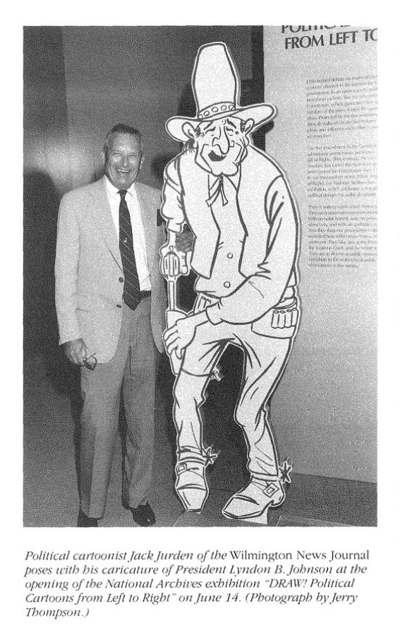
DRAW! Illustrator and over-sized exhibit icon of President Johnson from the Archives’ 1991 annual Report here.

Ink, Irony, and the American Eye: A (Very) Brief History of
Political Cartoons

Nearly 35 years ago, I worked on a museum exhibit that explored the cultural influence and reach of political cartoons. The National Archives hosted the exhibit “Draw! Political Cartoons from Left to Right” starting in 1991, which celebrated American political cartoons and their role in public discourse, as noted in their annual reports from 1991.

The exhibit company that I worked for produced and installed the exhibit. At a time from before large scale digital graphics have become widely used throughout the industry, we silkscreened all the text and background imagery on large painted panels. Hand drawn political cartoons were scanned, enlarged, and turned into photo stencils to serve as a kind of supergraphic to fit the many panels that lined the curved walls of the Circular Gallery.

Political cartoons have been part of the American conversation almost from the beginning. Long before radio, television, or the internet, these drawings carried arguments, insults, warnings, and humor directly to the public. Benjamin Franklin’s “Join, or Die” snake, published in 1754, is often cited as the starting point—not just of political cartooning in America, but of visual persuasion as a civic act. From the outset, cartoons were not decorative; they were meant to persuade, provoke, and occasionally unsettle.

The late eighteenth through the early twentieth centuries now feel, in hindsight, like the glory days of political cartooning. As literacy expanded and printing technology improved, newspapers multiplied at an astonishing rate. From a few hundred papers in the early 1800s, the country grew to thousands by the Civil War and beyond. Editorial pages became expected reading, and political cartoons claimed a permanent place there—bold, unavoidable, and often memorable long after the day’s headlines were forgotten.

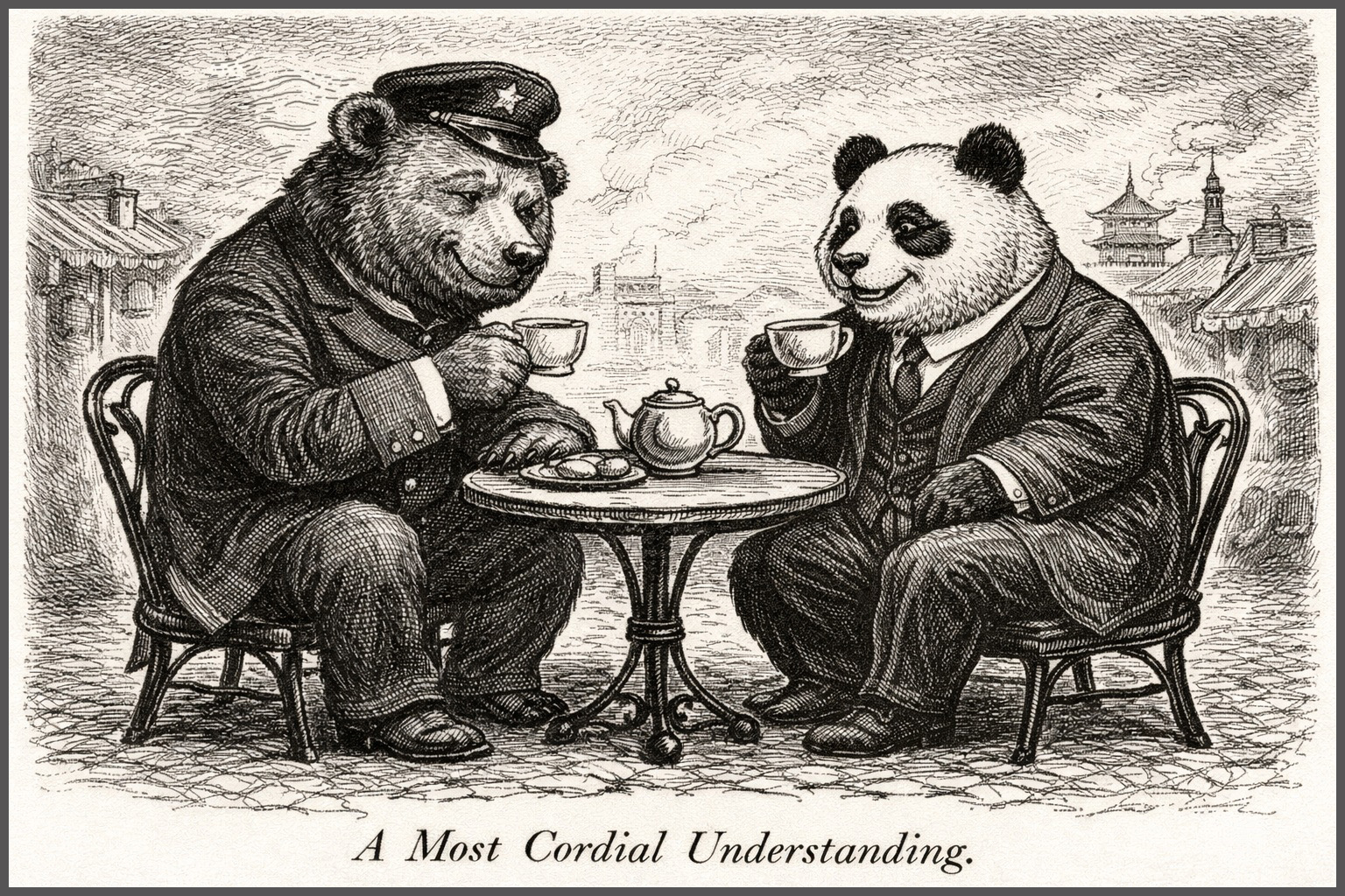
A Most Cordial Understanding is my first shot at a cartoon in the early style of 1840s Punch Magazine. It is very much in the Punch sweet spot: Polite on its face, slightly smug in tone, faintly ominous once you sit with it. We get a sense of two “respectable” powers conducting business as usual over tea; when paired with the recent pronouncements regarding Greenland, one can only wonder what they are really thinking.

This era produced giants whose influence still lingers. Thomas Nast’s crusade against Tammany Hall corruption helped bring down Boss Tweed and left us with the elephant and donkey as enduring political symbols. Others followed—Homer Davenport, John T. McCutcheon, Rollin Kirby—each shaping how Americans learned to “read” politics visually. Their drawings assumed patience and attention. They asked readers to stop, look, and think.

One of my favorites, Pat Oliphant stands out as one of the last great heirs to that lineage. His cartoons were spare, sharply drawn, and unsparing in their judgment. Presidents, generals, and bureaucrats were rendered slightly ridiculous, sometimes cruelly so, and always human. Oliphant’s recurring penguin—part conscience, part heckler—gave voice to public skepticism with a wit that felt earned rather than manufactured. Polite on its face. Slightly smug in tone.

What distinguished Oliphant’s work was its confidence in the medium. A single image, printed once a day, was enough. It didn’t need a monologue, a laugh track, or a follow-up explanation. You encountered it over coffee, folded into the paper, and it stayed with you. His cartoons were meant to be revisited, clipped, argued over, and remembered.

That world has largely disappeared. As newspapers have closed or shrunk, so too has the space for daily editorial cartooning. Political commentary has not vanished, but it has migrated. Memes flash by in seconds, optimized for recognition and outrage. Late-night television hosts and podcast personalities deliver satire in real time—often smart, often funny, but designed for immediacy rather than endurance. The encounter is louder, faster, and easier to share, but also easier to forget.

This shift doesn’t signal a decline in political engagement so much as a change in how it is experienced. Where cartoonists like Oliphant trusted silence and reflection, modern satire thrives on performance and momentum. Where cartoons once surprised readers on the editorial page, today’s commentary must be sought out, subscribed to, and algorithmically reinforced.

Looking back—through exhibitions like “Draw: Political Cartoons from Left to Right,” and through the artifacts that remain—it’s tempting to see that earlier period as a high point. Not because it was more civil or more virtuous, but because it trusted the reader. It trusted that a drawing could carry an idea, that ambiguity had value, and that satire could linger. In an age of endless commentary, the old cartoons remind us of the power of ink, restraint, and a moment of pause.

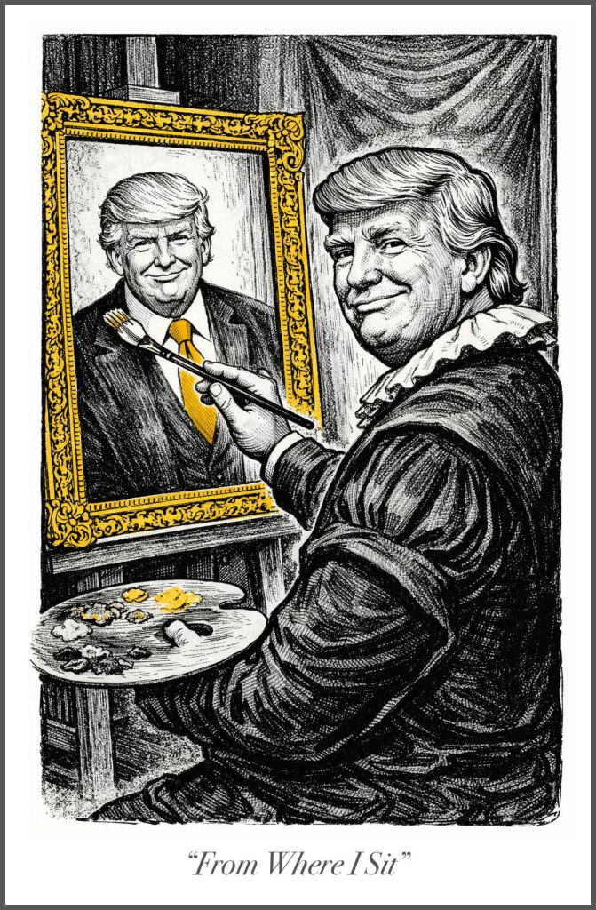
Below are a series of cartoons I’ve created over the past few weeks that incorporate that sense of urgency compiled with a mix of wry humor or satire. I’ve been using the considerable skills of ChatGPT augmented with my own perspective of the times in which we live. For good or ill, we find our country at a very troubling crossroads. I might not get out and walk in protest as I once did; it doesn’t mean I like what’s happening and am planning on remaining silent. Quiet maybe, but not silent.

Back to Work, Ozians!

Admittedly I haven’t read the books. So that’s an awkward place to start. But I have to wonder about “world-building” in these new movies. Movies, sequels, prequels, adjacent, streaming, stage play, stage play into a movie, all of that.

For me, I think it began with the Hobbit, followed up with reading the Lord of the Rings; which became a series of movies (six movies from four books, imagine that). The Wizarding World of Harry Potter spawned a complete set of movies, theme park, then a stage play, and now a series on HBO. 

My question has always been about the details: are these created fictional worlds filled out enough to sustain multiple iterations and new storylines, remain faithful to their source material, and still be entertaining? or at best, even plausible reality?

Frank Baum created a series of 14 full-length novels that tell the fictional history of the Land of Oz. That is quite a universe to explore. I’m tempted to pick up the first novel and see where all of this started.

Gregory Maguire wrote the book Wicked: The Life and Times of the Wicked Witch of the West,  published in 1995 and turned into a very successful stage musical and now a two-part movie. There are an additional three books in the reimagined OZ Universe by Maguire. In 2025 Maguire published a true prequel to Elphaba’s story, Elphie: A Wicked Childhood: This 2025 prequel details the early life of the character, Elphaba and is set 30 years before the events of Wicked

There has been recent online discussion (here) of Universal Pictures exploring additional movies set in the OZ universe. Though I found the saturated coloring of the sets designed by Nathan Crawley to be eye-popping in the first movie (more muted tones in the second), the Art Deco inspired Emerald City was off the charts! The more art nouveau inspired buildings of Munchkin land at least looked like they had been built by the people who lived there.

But all I could think of was, “who built this place? How does it run? Do they use electricity, or some kind of magic?” Folks are dancing across the stage in fitted costumes: they couldn’t possibly be the working class? Who are they? What do they do? Who keeps the lights on, works in the sanitation department, or runs their mass transit system? I can’t wait for more stories from the Oz Universe, hopefully we will get a glimpse behind the curtain of how it all works!

A Singular Vision

I’ve always appreciated the singular artistic vision of architect Frank Lloyd Wright. After looking through examples of his early work, primarily residences in the Midwest, I was struck by his embrace of modernism over then contemporary building styles. I had toured Fallingwater, the 1937 iconic summer retreat of Edgar and Liliane Kaufmann at Bear Run in Pennsylvania many years ago. Built in 1937, Fallingwater is perhaps one of the best examples of Wright’s mature style and his desire to merge the built environment with nature. 

The summer home of Grand Rapids businessman Meyer May and his wife Sophie that he designed and built in 1908-09 is a great example of Wright’s style as it transitioned during the early part of the 20th century. Settled into the community on a street corner, surrounded by other grand homes in the prevailing Victorian and Italian revival styles, his brick prairie-style home, nearly devoid of exterior ornamentation, seems peculiarly out of place. And indeed, our tour docent recounted how his children felt picked upon because they “lived in the weird house.”

The home is a grouping of rectangular volumes and piers, with low pitched roofing and deep overhangs. Unlike the red metalwork of Fallingwater, the copper metal trim work here is a dark brown color throughout that contrasts with the sand-colored brick and limestone. Though perceptably a minimalist structure, it seems to me that the exterior moldings, especially those over the dining room windows, recall Japanese motifs. The overhang on the eaves bears a similar appearance to Japanese pagoda rooflines. Wright had visited Japan in 1905 and his love of Japanese woodblock prints is well documented. According to one website, he first visited the country in 1905 and created an extensive photographic record. No doubt some aspects of his designs going forward incorporated those interests. 

While the Arts and Crafts Movement of the late 1800, early 20th Century anchored his initial designs, it seems that his stripped down mimimalism and incorporation of Asian design motifs (not to mention Native American) really took hold after 1910s Frederick C. Robie House in Oak Park. Again the long, stacked verandas recall the beautiful cantilevered trays of Fallingwater though constructed from brick rather than concrete. Each design features enclosed spaces, whether grand or intimate, that open up from or are connected with other spaces. The effect is a dynamic of seclusion and revelation.

From the Frank Lloyd Wright Trust, “In his design (of the Oak Park Unity Temple), Wright abandoned the use of traditional church features of tower, steeple, and nave, creating a “noble room” in which man could reflect upon God.” This approach to ecclesiastical design has had a profound influence on modern church design, for example the church we attend here in Northern Virginia and built 115 years after Unity Temple.  

Wright’s pursuit of harmony: exteriors and interiors, ornamentation and furnishings all working together represents an individual who gave attention to details as well as the grand vision. While I personally felt that the Meyer May house showcased too much of the designer and virtually nothing of the home’s owners, his cohesive design can’t be ignored. Everything from carpets to wall colors, woodwork to windows complements each other. Motifs and materials are repeated throughout the building and nothing is placed by accident or without regard to the overall design scheme. 

In 1987 Steelcase, the present owner of the Meyer May property, restored the home to it’s original design (along with removing a later building addition) and sourced either original or replicated furnishings of the time period. It remains a stunning example of one man’s creative vision, though I saw only a few photographs and personal possessions reminding us of the family who had lived there for 27 years. We browsed the gift shop before leaving, of course, and brought home a pair of FLW decorative mugs to commemorate our visit, a tribute to one man’s genius.

Meyer May Merchandise