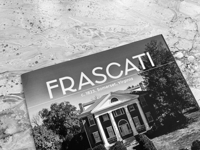
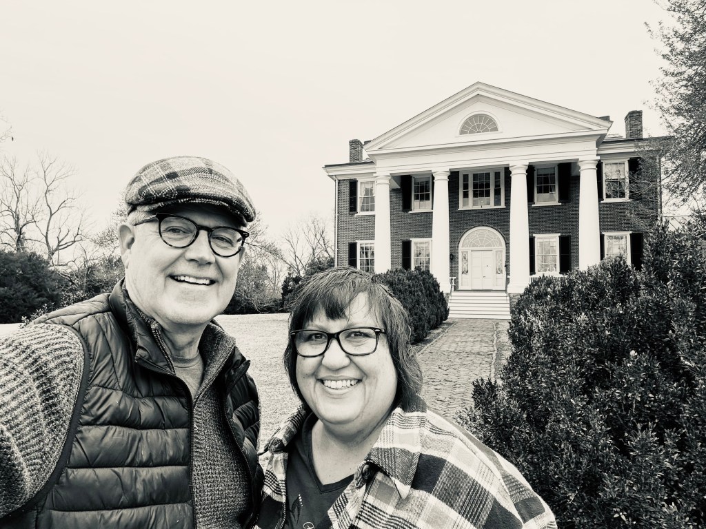
Last week we went for a preview of items to bid on from an auction at Frascasti, an 1823 brick mansion in central Virginia. Frascati was built for Philip Barbour, Associate Justice for the Supreme Court. John Perry, known for his work for Thomas Jefferson in building the University of Virginia and Monticello, oversaw construction. Frascati is on the National Register of Historic Places and is a Virginia Historic Landmark. The Federal-style brick home has a commanding view of the valley down through Somerset and on to the Blue Ridge Mountains. Hidden from the road by overgrown boxwoods, it must have been an imposing presence on the hill two centuries ago.
While the home isn’t open for tours, it was recently sold and the family, who had held the property for over four decades, released many of the furnishings in an estate auction. We went for the preview and had the opportunity to walk through the home as we marked our list of items to bid on.
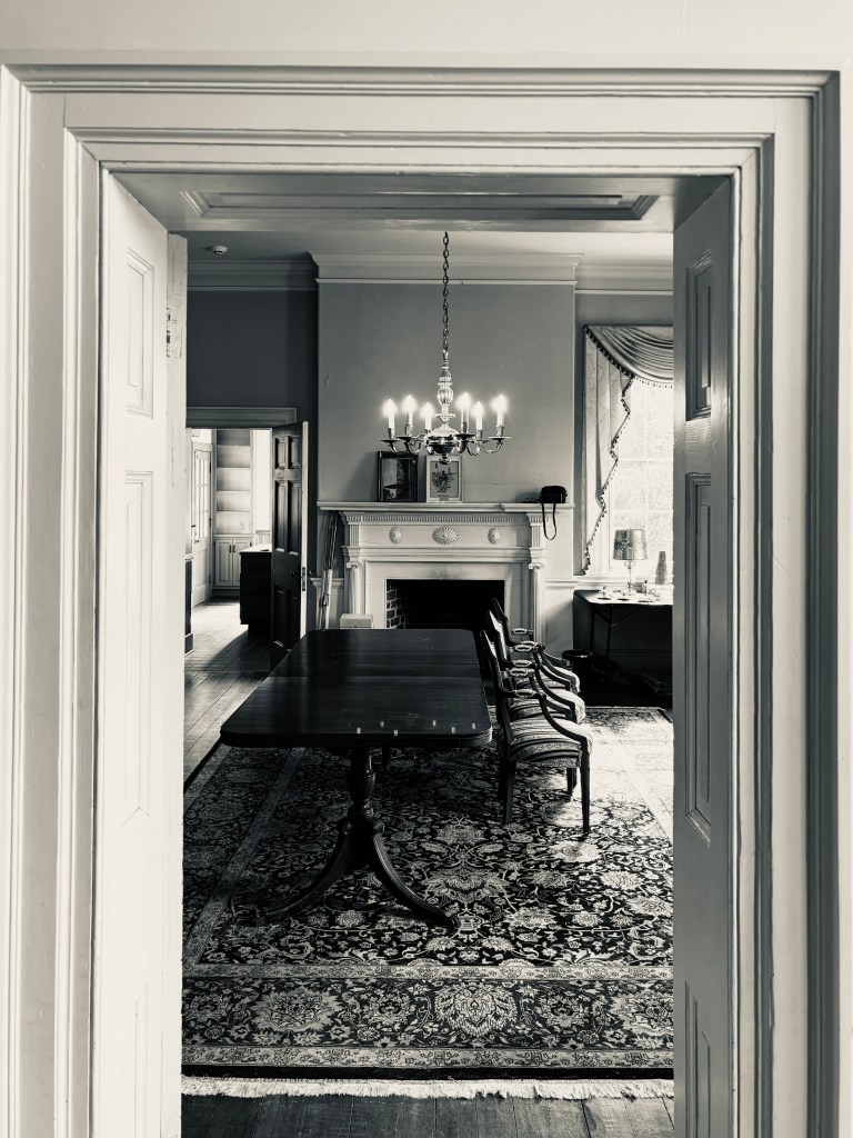
The peeling paint on the first floor walls gave no indication of the grandeur the home once possessed. Entering the parlor I was surprised at the size of the room, dominated by a large chandelier set within an immense ceiling medallion. Oftentimes even the light fixtures are auctioned off—this one wasn’t and I imagine that it will be staying with the home.
We walked from front parlor to office, on through the dining room and made our way upstairs to one of the bedrooms which had items on the auction list. We had intended bidding on a pair of crystal bedroom table lamps. They were as beautiful in person as they had appeared in the online catalog though their fragile shades would need replacing. Up another flight of stairs we found a third floor lunette window at the front of the house with an amazing view over the boxwoods to the neighboring properties beyond.


Frascati was one of four plantation homes in the area, only three of which still exist intact. A mansion designed by Thomas Jefferson, home to Governor Barbour, was built in 1820 and destroyed in a fire in 1848. Somerset Plantation, just down Rt 231 the Blue Ridge Turnpike, was built in 1821 and served as a design inspiration for Frascati. Montpelier, home to President James Madison and his wife Dolly, is now a historic site overseen by the Montpelier Foundation and owned by the National Historic Trust.
My first impression of the mansion? What an opportunity for a grand event venue or a ballroom! The ornate plaster crown moldings and soaring interiors just speak of the Regency era in England. With examples such as Downton Abbey and Bridgerton, what a venue this could be for concerts or recitals. There is an existing deed of easement signed by the owners in 1999 with the Virginia Board of Historic Resources which guides what can be done with the buildings and the 64 acres. It remains to be seen what the new owners choose to do with this historic property.


We ended up with a few items from the sale: a pair of crystal table lamps, three side chairs upholstered in a beautiful striped damask, two silverplate chafing dishes we hope to use for a party, a vintage illustrated book on Paris. As I was leaving, one of the daughters of the homeowner handed me a tiny green plastic house she had found while cleaning upstairs. A missing Monopoly game piece, she said, which went with the collection of games we had acquired. And then she spent several minutes telling me about each of the items we had purchased. I suppose it was her way of saying goodbye to a home she and her family had loved for more than 40 years and which had survived more than two hundred.