Letters From the Past


One of the most memorable examples of handwriting analysis appears in The Memoirs of Sherlock Holmes, in the story The Reigate Squire (also published as The Reigate Puzzle).

In that story, Sherlock Holmes examines a torn fragment of a note and performs a brilliant bit of analysis. He deduces that it was written by two different people—a younger man and an older one—based on subtle differences in pen strokes. Even more impressively, he observes that the two alternated writing individual words. From the handwriting alone, he infers personality traits and even the relationship between the writers (who turn out to be the Cunninghams, father and son).

Holmes explains his reasoning in terms both simple and elegant: the weak, irregular strokes of an elderly hand contrasted with the bold, confident lines of a younger one. The analysis becomes central to solving the crime.

The Reigate Squire is really a showcase—a kind of set piece built around handwriting as a forensic tool—and it remains one of the more scientifically intriguing episodes in the Holmes canon.

My own interest, however, is far more personal.

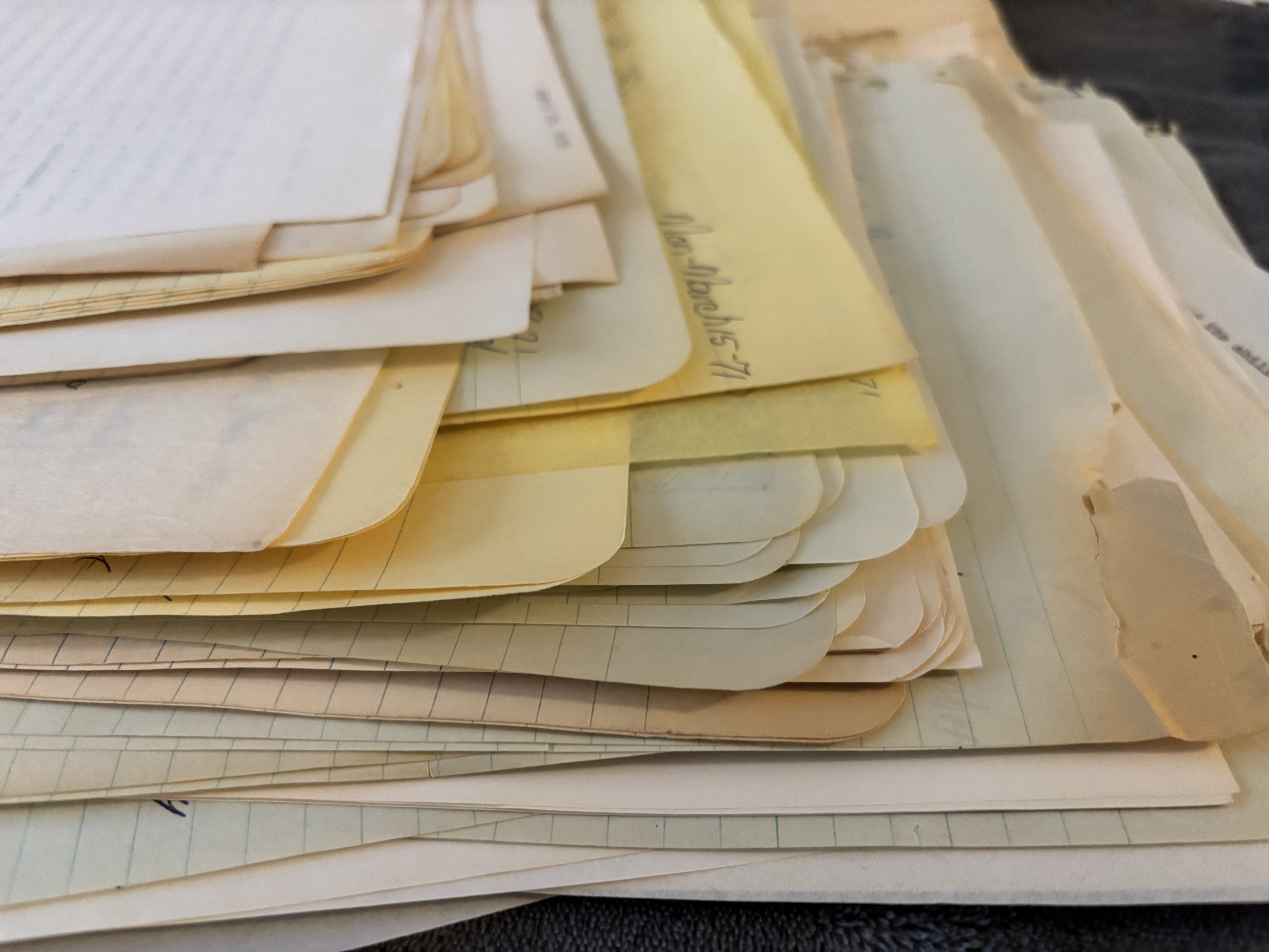
Recently, I came into possession of an envelope filled with old letters—ones I had written to my mother and stepfather more than fifty years ago. She had saved them all: along with grade school photos, birthday cards, and other bits of life that somehow survived the decades. When she moved into a smaller apartment, the whole collection found its way back to me.

And that raised an unexpectedly difficult question: what do you do with handwritten letters from the early 1970s?

Do you throw them away?
Or do you sit down and read them—slowly—and try to rediscover your 18-year-old self?

I chose a third option.

I scanned one of the letters and submitted it for handwriting analysis, pairing it with a recent sample of my writing. If nothing else, I thought, it might create a kind of “before and after”—a small window across half a century.

The results were…interesting.

What’s especially striking is not just that the structural traits match—it’s that the movement signature matches. Handwriting, it turns out, is less about the shapes themselves and more about how the hand moves across the page. In both samples, the rhythm, the rightward momentum, the confident t-bars, and the distinctive descender curves all carry the same kinetic “accent.”

In other words: it still feels like me.

What’s changed over time feels natural—almost reassuring:

  • The size is slightly reduced → more efficiency than diminished energy
  • The pressure is lighter → a common effect of age, as muscles soften
  • There’s a bit more angularity → often a sign of reflection and analysis
  • The baseline remains steady → suggesting continued motor control and cognitive stability

That consistency across decades points to something deeper: a stable personality core—expressive, engaged, structured in thought, and purposeful in communication.

And there’s one subtle distinction I find especially meaningful. The earlier sample shows an expansiveness of life; the later one shows a depth of thought. That’s not decline—it’s development.

The analysis itself considered a wide range of characteristics: letter size, loops and lines, pressure and stroke strength, formation patterns, rhythm, flow, even emotional tone. The conclusion was clear: this is the same writer.

But not the same person. Or perhaps more accurately—the same person, continued.

The evolution tells a quiet story:

  • Emotional expressiveness retained
  • Increased discipline and structure
  • A slight softening of stroke
  • A more deliberate, measured pace

If I had to summarize it in one sentence: the later sample reads like the same voice—just seasoned, steadier, and more intentional. It’s comforting to discover that 18-year-old me and 74-year-old me still have so much in common.

We don’t often get the chance to revisit our younger selves—much less to recognize them, and feel at ease with who they’ve become. It was a fun visit, less scary than I had expected. How about you? Have you taken any trips down Memory Lane lately?


DRAW!

DRAW! Illustrator and over-sized exhibit icon of President Johnson from the Archives’ 1991 annual Report here.

Ink, Irony, and the American Eye: A (Very) Brief History of
Political Cartoons

Nearly 35 years ago, I worked on a museum exhibit that explored the cultural influence and reach of political cartoons. The National Archives hosted the exhibit “Draw! Political Cartoons from Left to Right” starting in 1991, which celebrated American political cartoons and their role in public discourse, as noted in their annual reports from 1991.

The exhibit company that I worked for produced and installed the exhibit. At a time from before large scale digital graphics have become widely used throughout the industry, we silkscreened all the text and background imagery on large painted panels. Hand drawn political cartoons were scanned, enlarged, and turned into photo stencils to serve as a kind of supergraphic to fit the many panels that lined the curved walls of the Circular Gallery.

Political cartoons have been part of the American conversation almost from the beginning. Long before radio, television, or the internet, these drawings carried arguments, insults, warnings, and humor directly to the public. Benjamin Franklin’s “Join, or Die” snake, published in 1754, is often cited as the starting point—not just of political cartooning in America, but of visual persuasion as a civic act. From the outset, cartoons were not decorative; they were meant to persuade, provoke, and occasionally unsettle.

The late eighteenth through the early twentieth centuries now feel, in hindsight, like the glory days of political cartooning. As literacy expanded and printing technology improved, newspapers multiplied at an astonishing rate. From a few hundred papers in the early 1800s, the country grew to thousands by the Civil War and beyond. Editorial pages became expected reading, and political cartoons claimed a permanent place there—bold, unavoidable, and often memorable long after the day’s headlines were forgotten.

A Most Cordial Understanding is my first shot at a cartoon in the early style of 1840s Punch Magazine. It is very much in the Punch sweet spot: Polite on its face, slightly smug in tone, faintly ominous once you sit with it. We get a sense of two “respectable” powers conducting business as usual over tea; when paired with the recent pronouncements regarding Greenland, one can only wonder what they are really thinking.

This era produced giants whose influence still lingers. Thomas Nast’s crusade against Tammany Hall corruption helped bring down Boss Tweed and left us with the elephant and donkey as enduring political symbols. Others followed—Homer Davenport, John T. McCutcheon, Rollin Kirby—each shaping how Americans learned to “read” politics visually. Their drawings assumed patience and attention. They asked readers to stop, look, and think.

One of my favorites, Pat Oliphant stands out as one of the last great heirs to that lineage. His cartoons were spare, sharply drawn, and unsparing in their judgment. Presidents, generals, and bureaucrats were rendered slightly ridiculous, sometimes cruelly so, and always human. Oliphant’s recurring penguin—part conscience, part heckler—gave voice to public skepticism with a wit that felt earned rather than manufactured. Polite on its face. Slightly smug in tone.

What distinguished Oliphant’s work was its confidence in the medium. A single image, printed once a day, was enough. It didn’t need a monologue, a laugh track, or a follow-up explanation. You encountered it over coffee, folded into the paper, and it stayed with you. His cartoons were meant to be revisited, clipped, argued over, and remembered.

That world has largely disappeared. As newspapers have closed or shrunk, so too has the space for daily editorial cartooning. Political commentary has not vanished, but it has migrated. Memes flash by in seconds, optimized for recognition and outrage. Late-night television hosts and podcast personalities deliver satire in real time—often smart, often funny, but designed for immediacy rather than endurance. The encounter is louder, faster, and easier to share, but also easier to forget.

This shift doesn’t signal a decline in political engagement so much as a change in how it is experienced. Where cartoonists like Oliphant trusted silence and reflection, modern satire thrives on performance and momentum. Where cartoons once surprised readers on the editorial page, today’s commentary must be sought out, subscribed to, and algorithmically reinforced.

Looking back—through exhibitions like “Draw: Political Cartoons from Left to Right,” and through the artifacts that remain—it’s tempting to see that earlier period as a high point. Not because it was more civil or more virtuous, but because it trusted the reader. It trusted that a drawing could carry an idea, that ambiguity had value, and that satire could linger. In an age of endless commentary, the old cartoons remind us of the power of ink, restraint, and a moment of pause.

Below are a series of cartoons I’ve created over the past few weeks that incorporate that sense of urgency compiled with a mix of wry humor or satire. I’ve been using the considerable skills of ChatGPT augmented with my own perspective of the times in which we live. For good or ill, we find our country at a very troubling crossroads. I might not get out and walk in protest as I once did; it doesn’t mean I like what’s happening and am planning on remaining silent. Quiet maybe, but not silent.